
Top
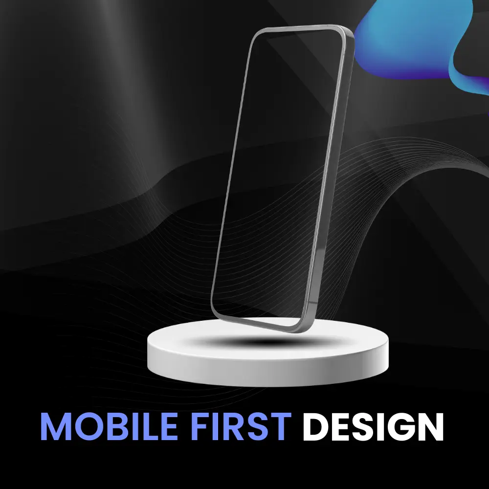


The Significance of Mobile-First Design for Websites
Welcome to the world of web design where the mobile-first approach takes center stage! With smartphones becoming everyone’s constant companions, crafting websites tailored for mobile devices has evolved from a trend to a necessity. As our digital realm swells with an ever-growing mobile audience, it’s time to ensure they receive an experience that’s both captivating and seamless.
Hold on tight, as this article takes you on a journey through the heart of mobile-first design. We’ll dive into the reasons that make it an imperative strategy, unwrap the delightful benefits it brings, and even equip you with some insider tips for a smooth implementation. So, why is mobile-first design such a buzz? Think about the booming number of mobile users who love to surf, shop, and explore on the go.
As we embark on this exploration, you’ll discover how putting mobile users front and center can lead to captivating user interactions, broader engagement, and even an impressive spot in the Google search hierarchy. The road ahead promises insights into the “why,” “what,” and “how” of mobile-first design. Get ready to transform your website into a mobile-friendly marvel that users will truly adore.
Why Mobile-First Design Matters?
Mobile users are soaring, and their browsing habits are reshaping the digital landscape. Responsive design alone won’t cut it. Speedy loading times, smooth user experiences, and SEO benefits await those who embrace mobile-first design. Let’s delve into why this matters and how it amplifies your digital presence.
Mobile Users Are on the Rise
Mobile-first design is the speedster’s ally. By prioritizing essential content, images, and elements, it ensures swift loading on mobile devices. Loading times wield significant power, influencing user satisfaction and bounce rates. Slow loading frustrates users, often leading to quick exits. Mobile-first design cuts the waiting game, keeping users engaged and content delivered in a flash.
Improved User Experience:
A seamless experience across devices is the gold standard. Mobile-first design ensures a consistent journey, irrespective of the screen size. Frustrations mount when sites aren’t mobile-friendly – pinching, zooming, and endless scrolling. With mobile-first design, bid adieu to these woes, embracing a harmonious user experience that keeps visitors delighted and engaged.
SEO Benefits: Step into Google’s world with mobile-first indexing. Your mobile site takes the lead in ranking. Now, the game-changer is mobile-friendly designs. They’re not just about aesthetics; they catapult your site up the search ranks. Faster loading, happier users, and lower bounce rates follow suit. Your action plan? Craft a mobile-friendly haven, where seamless user experiences meet SEO rewards. It’s your ticket to digital success, impress both your audience and search engines with strategic mobile-first design choices.
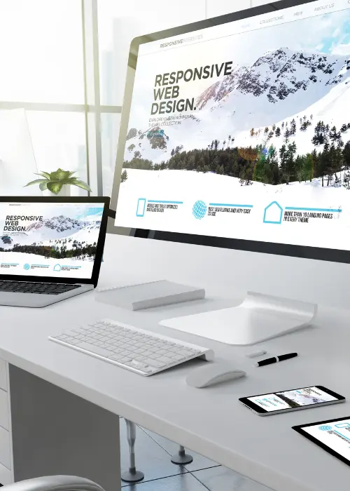
Responsive Design is Not Enough:
While responsive design is a step in the right direction, it’s not the ultimate solution for impeccable mobile experiences. Resizing desktop designs to fit mobile screens can fall short in optimizing user experiences.
Here’s why:
Content Overload: Desktop designs often carry excess content that overwhelms mobile users.
Navigation Challenges: Navigational elements meant for cursor interaction might not translate well to touch screens.
Slower Load Times: Loading all elements intended for larger screens can slow down mobile load times.
Crafting specifically for mobile ensures streamlined content and a seamless user journey, meeting the unique needs of mobile users.
Responsive Design is Not Enough
While responsive design is a step in the right direction, it’s not the ultimate solution for impeccable mobile experiences. Resizing desktop designs to fit mobile screens can fall short in optimizing user experiences.
Here’s why:
Content Overload: Desktop designs often carry excess content that overwhelms mobile users.
Navigation Challenges: Navigational elements meant for cursor interaction might not translate well to touch screens.
Slower Load Times: Loading all elements intended for larger screens can slow down mobile load times.
Crafting specifically for mobile ensures streamlined content and a seamless user journey, meeting the unique needs of mobile users.
Faster Loading Time
While responsive design is a step in the right direction, it’s not the ultimate solution for impeccable mobile experiences. Resizing desktop designs to fit mobile screens can fall short in optimizing user experiences.
Here’s why:
Content Overload: Desktop designs often carry excess content that overwhelms mobile users.
Navigation Challenges: Navigational elements meant for cursor interaction might not translate well to touch screens.
Slower Load Times: Loading all elements intended for larger screens can slow down mobile load times.
Crafting specifically for mobile ensures streamlined content and a seamless user journey, meeting the unique needs of mobile users.
Benefits of Mobile-First Design
Mobile-first design isn’t just a trend; it’s a game-changer. Engage users with captivating experiences, maintain consistent branding across devices, boost conversion rates, and expand your reach to a broader audience. Let’s uncover the potent advantages that await those who embrace the mobile-first approach.
- Enhanced User Engagement: Mobile-first design thrives on simplicity and user-centric content. Limited screen real estate demands clarity, prompting concise yet impactful messages. Engaging mobile experiences, from intuitive navigation to captivating visuals, keep users hooked. The result? Increased interaction (swipes, taps, and clicks) as users effortlessly navigate through content crafted with their needs in mind.
- Consistent Branding: Branding isn't confined to desktop screens. It extends to mobiles, ensuring a seamless identity across devices. Mobile-first design serves as a branding compass, guiding elements like color, typography, and logo placement. By upholding a unified brand experience, businesses reinforce familiarity and trust, creating a harmonious journey for users, whether they're browsing on a laptop or a smartphone.
- Increased Conversion Rates: Mobile designs, with their distilled essence, sharpen the focus on calls to action. Stripped of distractions, users are guided toward clear and compelling prompts. The payoff? Conversion rates soar. Mobile optimization ensures smoother, swifter interactions, eliminating friction that often plagues desktop experiences. A mobile-first strategy isn't just about aesthetics; it's about driving conversions with laser precision.
- Broader Audience Reach: Mobile devices transcend boundaries, reaching even regions with limited internet access. Enter mobile-first design, your ticket to a global audience. It caters to various screen sizes and connection speeds, ensuring inclusivity. By embracing this approach, businesses extend their reach, welcoming diverse users who seek to engage, regardless of their location or device.
Implementing Mobile-First Design
Ready to roll up your sleeves? Let’s dive into the practical realm of implementing mobile-first design. From strategic content planning to touch-friendly navigation, we’ll navigate through the actionable steps that transform your vision into a mobile masterpiece. Let’s unleash the power of mobile-first design together.
- Start with a Content Strategy: Mobile-first design thrives on simplicity and user-centric content. Limited screen real estate demands clarity, prompting concise yet impactful messages. Engaging mobile experiences, from intuitive navigation to captivating visuals, keep users hooked. The result? Increased interaction (swipes, taps, and clicks) as users effortlessly navigate through content crafted with their needs in mind.Picture your content as the cornerstone of your mobile-first design journey. Begin by understanding what's crucial. This clarity fuels effective design decisions. Prioritize essential content, aligning it with the mobile screen's limitations. This strategic approach ensures that your users get precisely what they need without overwhelming them. Let your content strategy guide your design choices, ensuring a harmonious blend of form and function.
- Design for Touch Interaction: Here's the tactile magic: touch screens demand user-friendly design. Envision generous buttons that beckon fingertips with ease. Prioritize ample spacing between elements to prevent accidental taps. Embrace intuitive gestures, swipes, and pinches for effortless navigation. Remember, users crave a seamless touch experience. Design with their tactile journey in mind, crafting an interface that responds effortlessly to their touch, fostering engagement and satisfaction.
- Harness Responsive Frameworks: Unlock design efficiency with responsive frameworks like Bootstrap and Foundation. These powerhouses streamline mobile-first design, offering ready-to-use components that ensure consistency across devices. Think of them as your design allies, simplifying the creation of responsive layouts, grids, and interactive elements. With responsive frameworks, you're equipped to deliver a seamless mobile experience that's both captivating and user-friendly.
- Optimize Images and Media: Speed matters especially on mobile. Trim loading times by optimizing images and videos for mobile screens. Embrace techniques like lazy loading, images load as users scroll preserving bandwidth and enhancing speed. Employ responsive media elements that adjust seamlessly to different screen sizes. Elevate user experiences with swift, visually appealing content, ensuring they stay engaged without the waiting
- Testing and Iteration: Put your design through the paces on diverse mobile devices. Thorough testing guarantees a consistent experience. But it doesn't end there – embrace an iterative journey. User feedback becomes your compass, guiding refinements that enhance usability and address pain points. Testing and refining ensure your mobile-first design evolves into a flawless masterpiece.
Conclusion
In the realm of mobile-first design, expertise is key, and that’s where Sage Titans excels. With a wealth of experience in digital transformation and marketing, we understand the intricacies of crafting captivating mobile experiences. If you’re ready to transform your online presence, look no further. Let our seasoned team guide you through the intricacies of mobile-first design. Your users deserve nothing less than the best, and together, we can ensure that your website becomes a mobile-friendly masterpiece. Reach out to us today to discuss your mobile-first design requirements and elevate your digital presence to new heights.
Feel FREE To share THIS ARTICLE with your friends:
Facebook
Twitter
LinkedIn
WhatsApp


We use cookies to improve your experience on our site. By using our website, you’re agreeing to the collection of data as described in our Privacy Policy.
✕